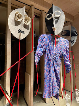
Great use of colour. We're not entirely sure if we like the giant Apples here but what a wonderful use of colour in a scheme. We particularly love how the Blue's absolutely pop out against the Orange tones (well they are complimentary colours so naturally they will). There is also an interesting use of pattern on the flooring too although overall the scheme is difficult to track back through to the brands website which is a shame as we would like to understand the connection here.
Check out our fantastic sponsors below for incredible Visual Merchandising solutions or click on the banners on the side of the main page at www.retailstorewindows.com


